The honest part: we're built for function, not form — and you keep both
There are two kinds of org chart tools, built for two different jobs. Diagram tools — Lucidchart, Visio, Creately and the rest — are built for form: themes, custom shapes, drag-and-drop design, a polished picture for a board deck. PowerPCS is built for function: understanding your workforce — what it costs, who's in it, where the gaps are. It's made to be accurate and current, not to win a design award, and we're upfront about that.
Here's the part that surprises people: choosing function doesn't cost you the form. If a polished chart is part of your job, keep the diagram tool you love — and let PowerPCS be the source it's built from. One click exports your whole structure — reporting lines and all, plus cost, FTE, and vacancies — as a spreadsheet that drops straight into Lucidchart, Visio, or whatever you use. The difference is that the export is always current and reconciled to the budget, so the diagram you paste in isn't already out of date the moment you make it. Function and form — you don't have to pick.
"Can't I just make an org chart in Excel?"
Plenty of people do — with SmartArt, shapes, or a hierarchy of cells — and for a one-time snapshot to print or drop in a deck, it's fine. If that's all you need, an Excel chart or a diagram tool will get you there faster than any software will.
The trouble starts the day after you build it. An Excel org chart hits two walls the moment your organization is real:
- It goes stale instantly. Someone transfers, a role is added, a person leaves — and the chart is wrong until you sit down and redraw it by hand. It's a snapshot of one day, not a live view.
- The boxes don't know anything. A shape in Excel is just a name in a box. It can't tell you what the seat costs, whether it's budgeted, whether it's filled or vacant, or what a whole branch adds up to — those numbers live on some other tab, if they exist at all.
Which is exactly why the org chart and the headcount budget end up as two separate spreadsheets that quietly disagree. If that's the problem you actually have, no amount of Excel skill fixes it — because it isn't a drawing problem.
A pretty diagram doesn't answer the questions you actually have
Here's the thing about a hand-built org chart, no matter how good it looks: the boxes are just names. Stare at one and it can't tell you:
- Is this seat even budgeted? Or did someone add a box for a role that was never approved?
- Is it filled or vacant? A box for an empty, still-funded position looks identical to a box for a person who started yesterday.
- What does it cost? And what does this whole branch cost, rolled up?
- Is this department over or under budget? The chart has no idea — it's a drawing, not a dataset.
- Is it still current? The moment someone reorganizes, a hand-drawn chart is wrong, and stays wrong until a human redraws it.
Those are budget and headcount questions. A diagram tool was never built to answer them — it was built to make shapes.
What "org chart" means when you're in HR or Finance
You don't actually want art. You want the reporting structure tied to something real: the budgeted positions underneath it, the people in them, the cost of each, and the gaps. You want a chart that's a view of your data, not a picture someone maintains on the side and forgets to update.
That's a fundamentally different thing than a diagramming app — and it's the thing spreadsheets and drawing tools both leave you without.
What the PowerPCS org chart does — and doesn't
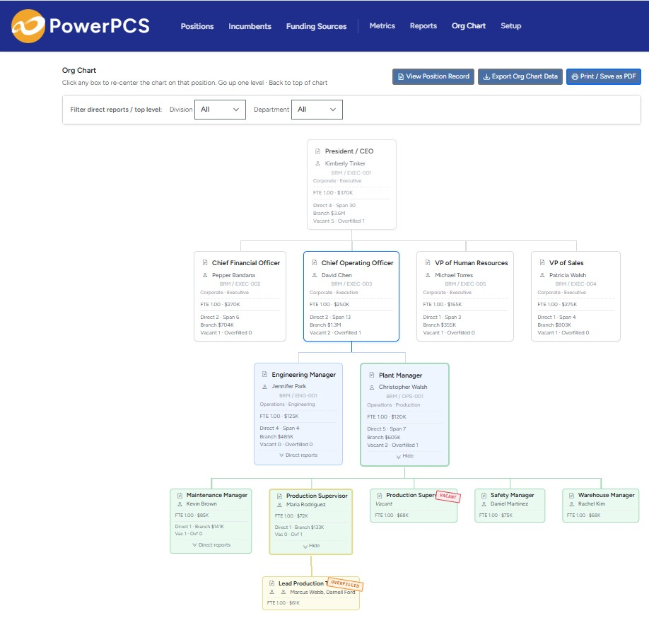
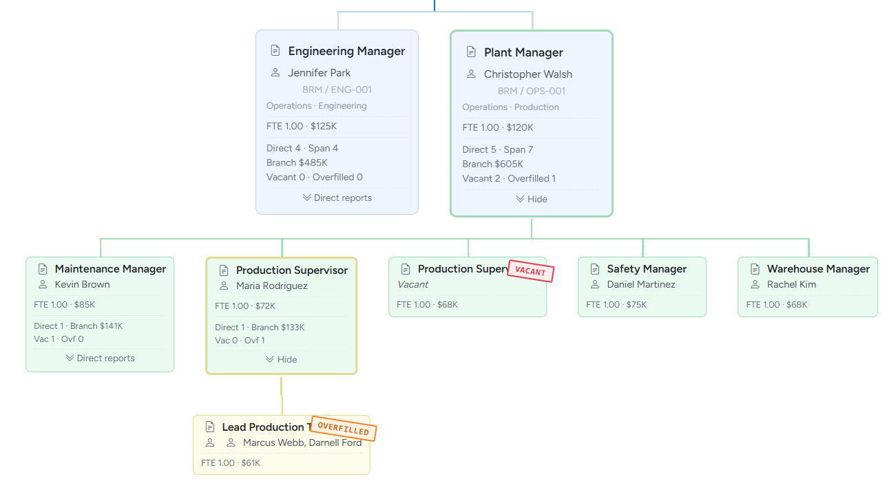
It does: build itself from your position data, show budgeted cost and FTE on every node, mark vacant and overfilled seats, roll cost up by branch, and stay correct automatically because it's generated from the same records your budget lives in. Reorganize a position and the chart just… reflects it.
It doesn't: chase custom themes, freehand layout, or decorative shapes — it isn't trying to be your design tool. When you need the glossy, presentation-ready version, that's the one-click export into a tool built for it. The chart here isn't the product — it's a live window into the position and budget data that is.
The bottom line
You're not really trading a good-looking chart for a useful one. You get an org chart that's always accurate — because no one draws it by hand — with the budget behind every box, so "who reports to whom" and "what does it cost and is it funded" stop being two separate spreadsheets that disagree. And the day you need the boardroom version, it's one click into your design tool.
If you've ever needed the org chart and the headcount budget to finally be the same thing, that's exactly what this is built to do. It's the visible tip of position control: tracking the budgeted jobs, not just the people.